LUN Misto. How to show the city better
Story about how I and 5 more designers within the Professium training course researched, tested, and designed a cool tool instead of a simple map.
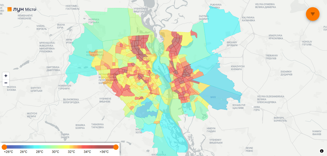
Map LUN Misto before
Who will we work with?
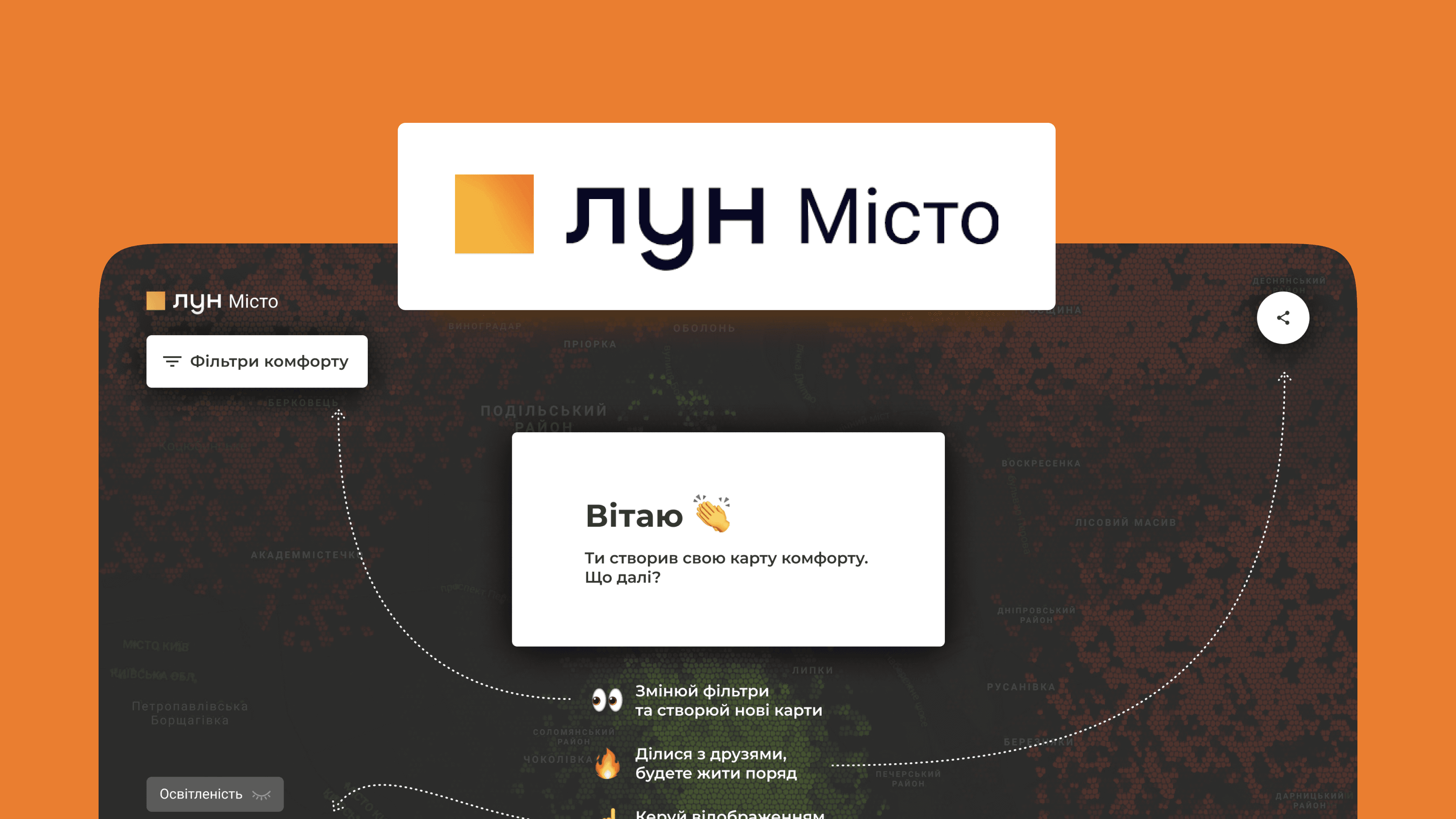
LUN City is a social project that analyzes city data and tells about them in an accessible way.
The goal of the project: is to answer the question: "Where is comfortable in Kyiv?". Not only to buy an apartment but also to find out where to rent a house, go for a walk, send a child to school, etc.
Global mission of the project: to encourage areas with a low level of comfort to reach areas with high indicators.
We needed to redesign the comfort map of the city, conveniently visualize the data, and help people find a better place to live and relax in Kyiv.
So what is needed?
After talking about the problems and wishes with Anya, the manager of LUN City, we identified the main tasks that we will solve:
Prototype map on which the criteria for the comfort of life in the city are conveniently displayed;
Make it possible to view several layers with criteria on the map at the same time;
Make a solution that is easily scalable and universal (should not depend on current criteria).
And how to do it?
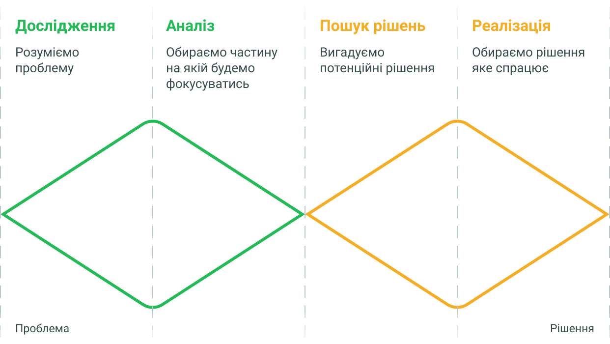
The Double Diamond methodology helped us build a problem-solving process.
Interview
In the first stage, we needed to collect as much information as possible. It was clear that it was necessary to communicate with people. But how to find the same ones people? We decided to talk to those who recently bought or rented housing.
We conducted 25 interviews to find out what comfort is for people most important when choosing housing and by what criteria they choose places where to live and walk. For convenience, all interviews were translated into text, which began to analyze and find the pains, joys and tasks they set for themselves people.
I conducted 4 interviews, in which we found several interesting insights and confirmed our hypotheses about a comfortable city.
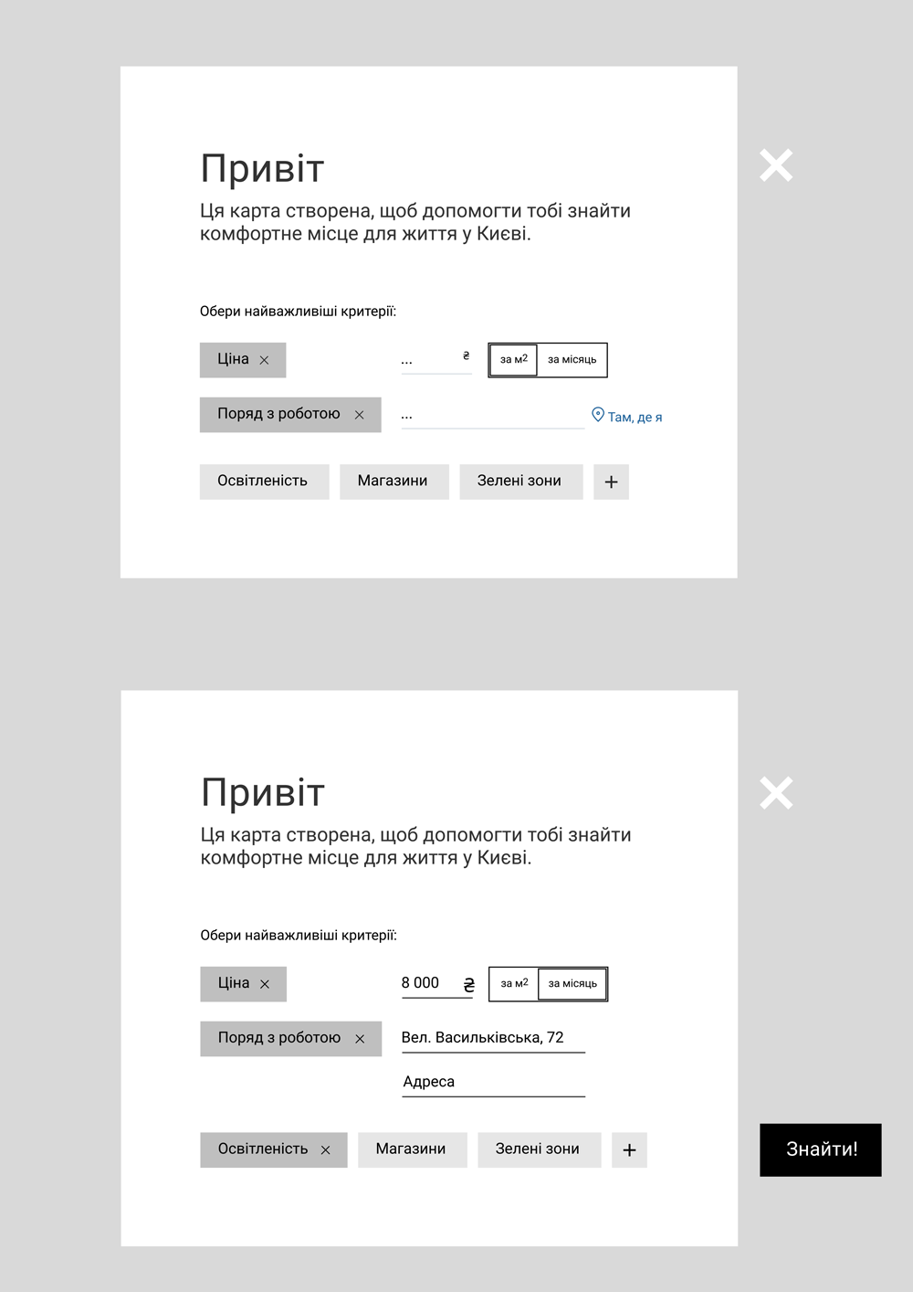
We made large groups of similar stickers into filter categories.
Pains, joys and problems — so what?
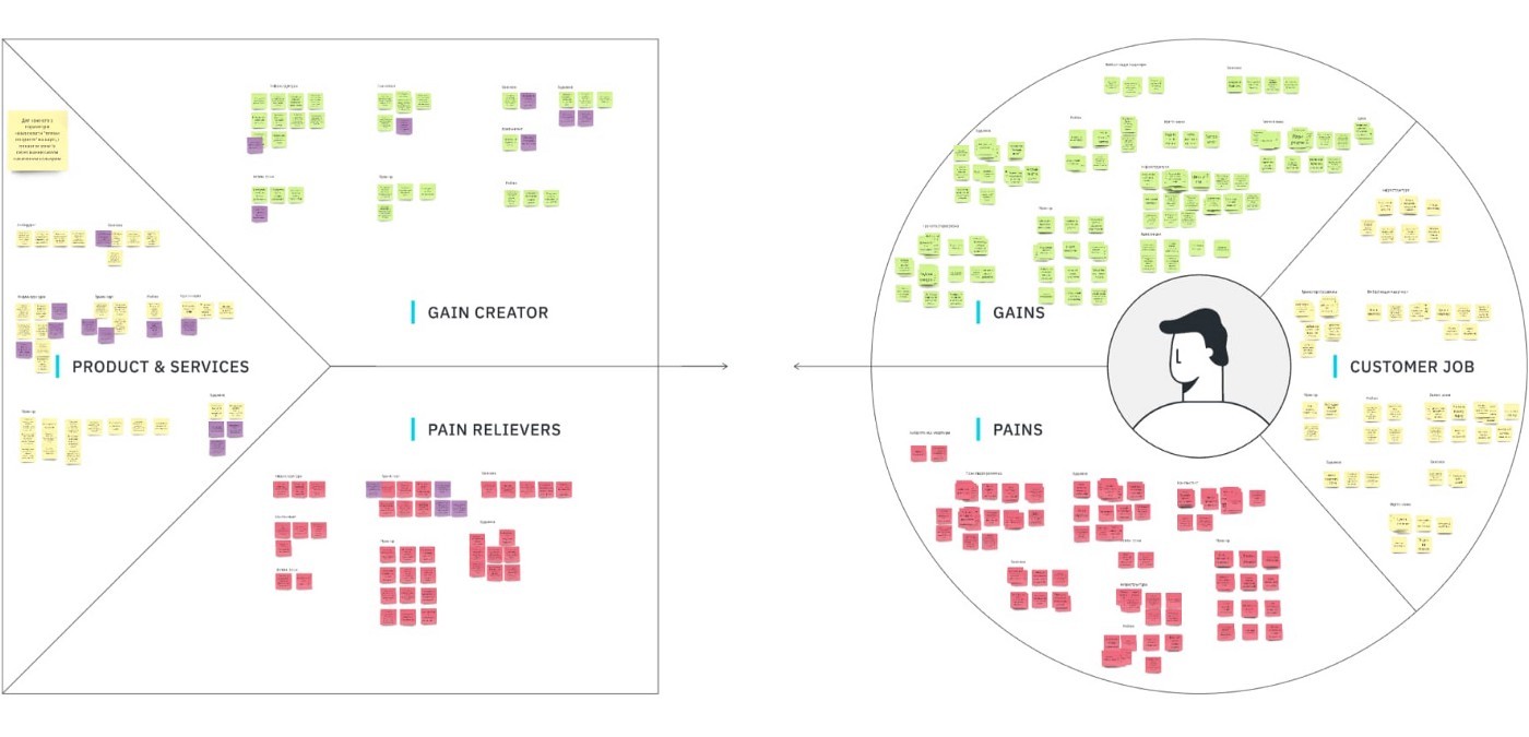
In order not to get confused in all that, we used the Value Proposition Canvas tool and laid out all the information we found on the board.
Finally, it became clearer to us what was going on — we saw what really bothered people.
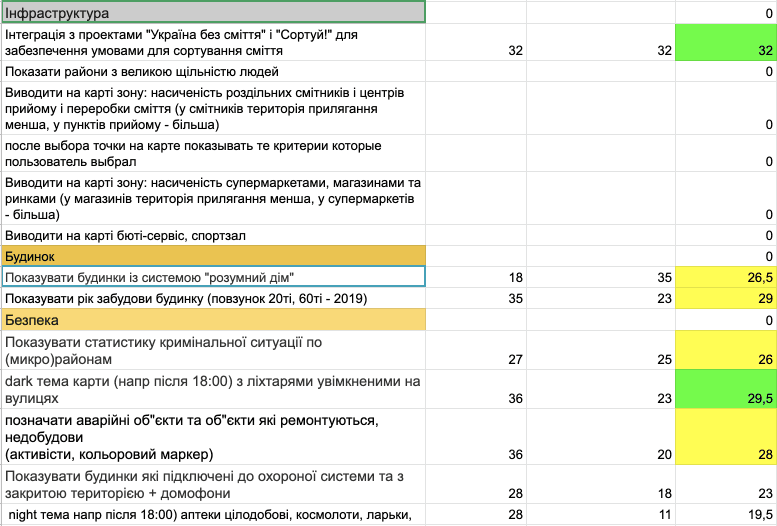
We came up with hypotheses and solutions for each group of pains, joys and problems. There were many of them and we decided to prioritize them according to three criteria: development complexity, user satisfaction and personal wishes.
Prototype
People were talked to, stickers were pasted, hypotheses were invented, a design needs to be made. How to do? What shall I do? Where to do? Okay, let's go!
Let's make it cool, not like it is now. (spoiler - we did)
We have a concept. There will be 3 types of layers with their own filtering categories: areas where we will show green areas, population density, etc., streets - lighting and traffic jams, houses - infrastructure, heat storage, etc. They can be combined by choosing one category in each layer.
💡
But Olesya wrote one morning: "I came up with it. It is necessary to operate with hexes. Any territory (in our case Kyiv) can be divided into hexagons, give them meaning. When overlaying cards, carry out mathematical operation and determine the value of the resulting hex (and, accordingly, its color)".
We spent the whole day brainstorming to figure out if this is a better solution than what's already there? And such yes! We agreed that it could be more practical.
We can imagine how it will look, let's move on!
After testing the existing map, they found that people do not understand where they are on this map, why they need it and where to look. We decided that we needed onboarding and started making a prototype.
Teeeeeeests
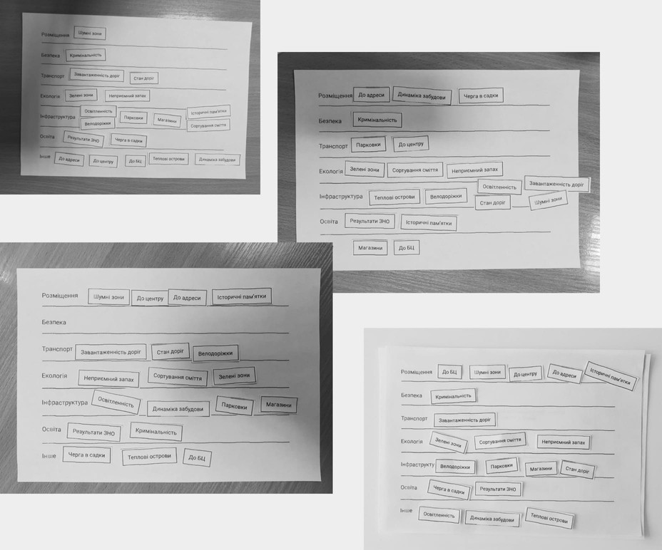
If the onboarding tests went well, people knew where to look and what will be, then the pain started. After opening the filters, people did not understand the name categories, how they are displayed, how to choose several parameters. Ago I also had to sort the filters by category.
Desiiiiiign
When we were satisfied with the tests, we moved on to the visualization tool and the whole team gave the powers of the "photoshop god" to Olesya because she said that sees how it should be. We trusted. They wrote dozens of comments to her to do better (we are also designers).
P.S. Olesya said that we all designed together. And we argued a lot.
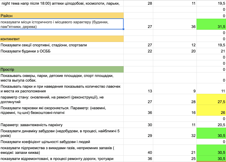
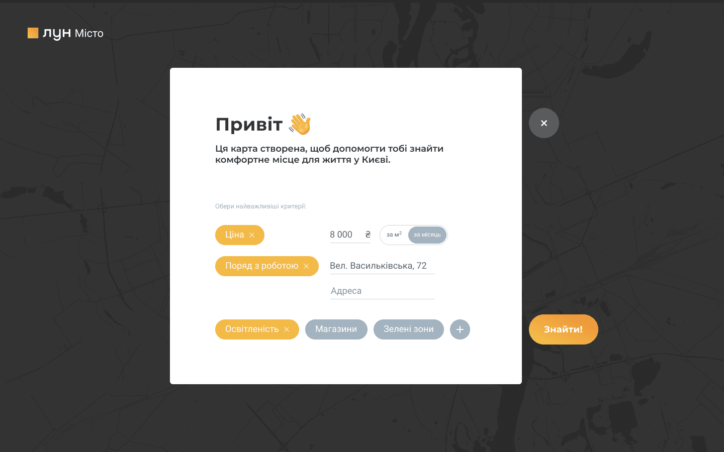
We tell you what this map is for and offer to choose popular filters
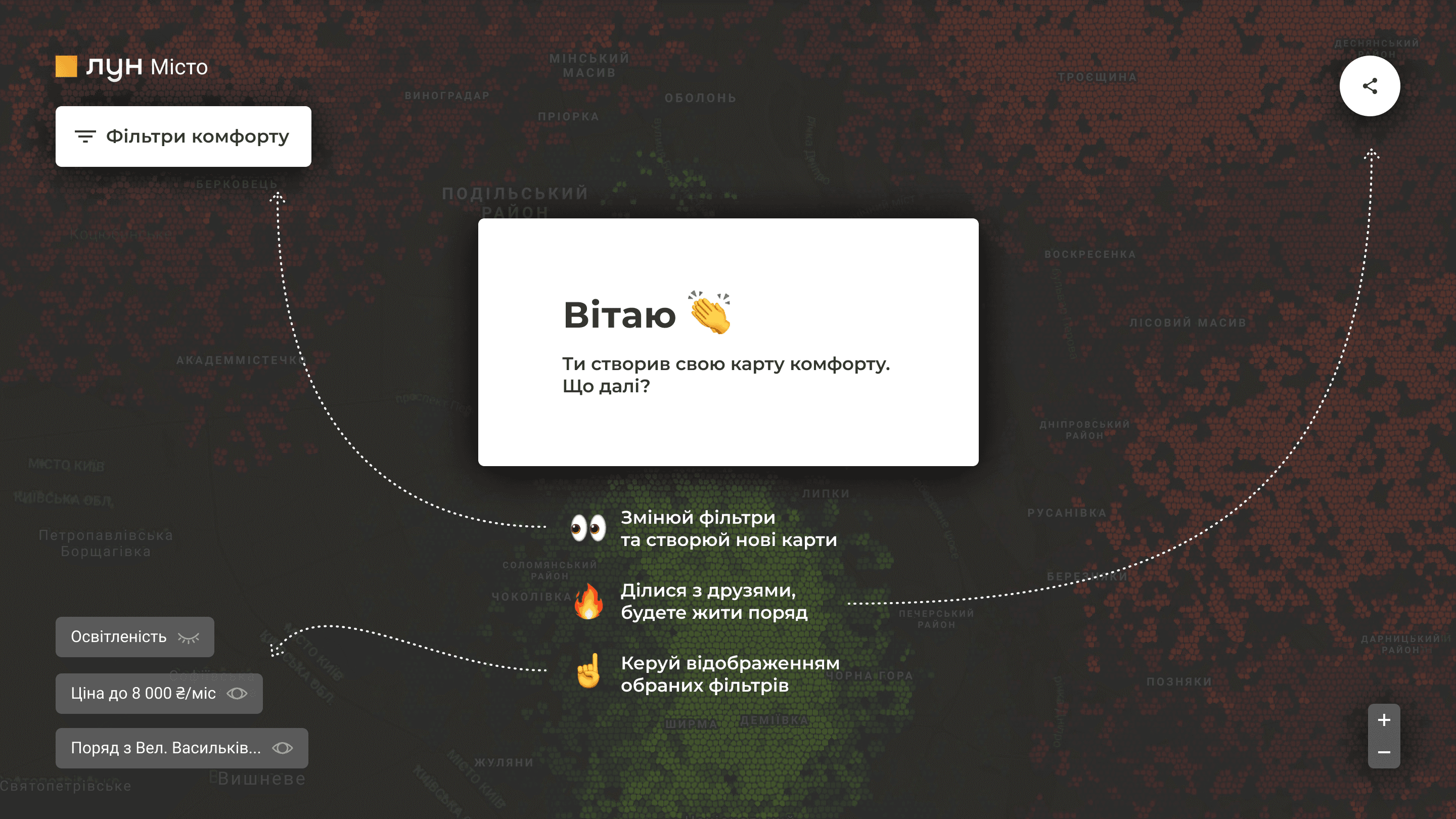
We inform the person about what happened
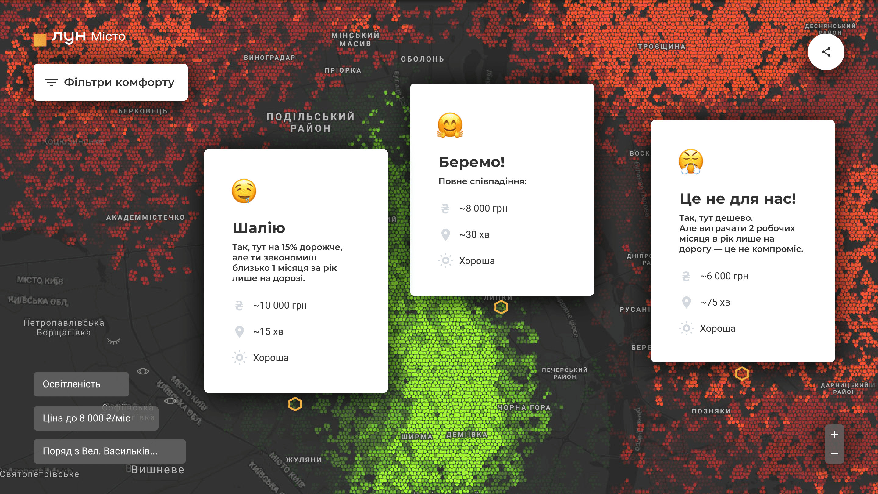
This is how the information about the selected areas on the map looks like
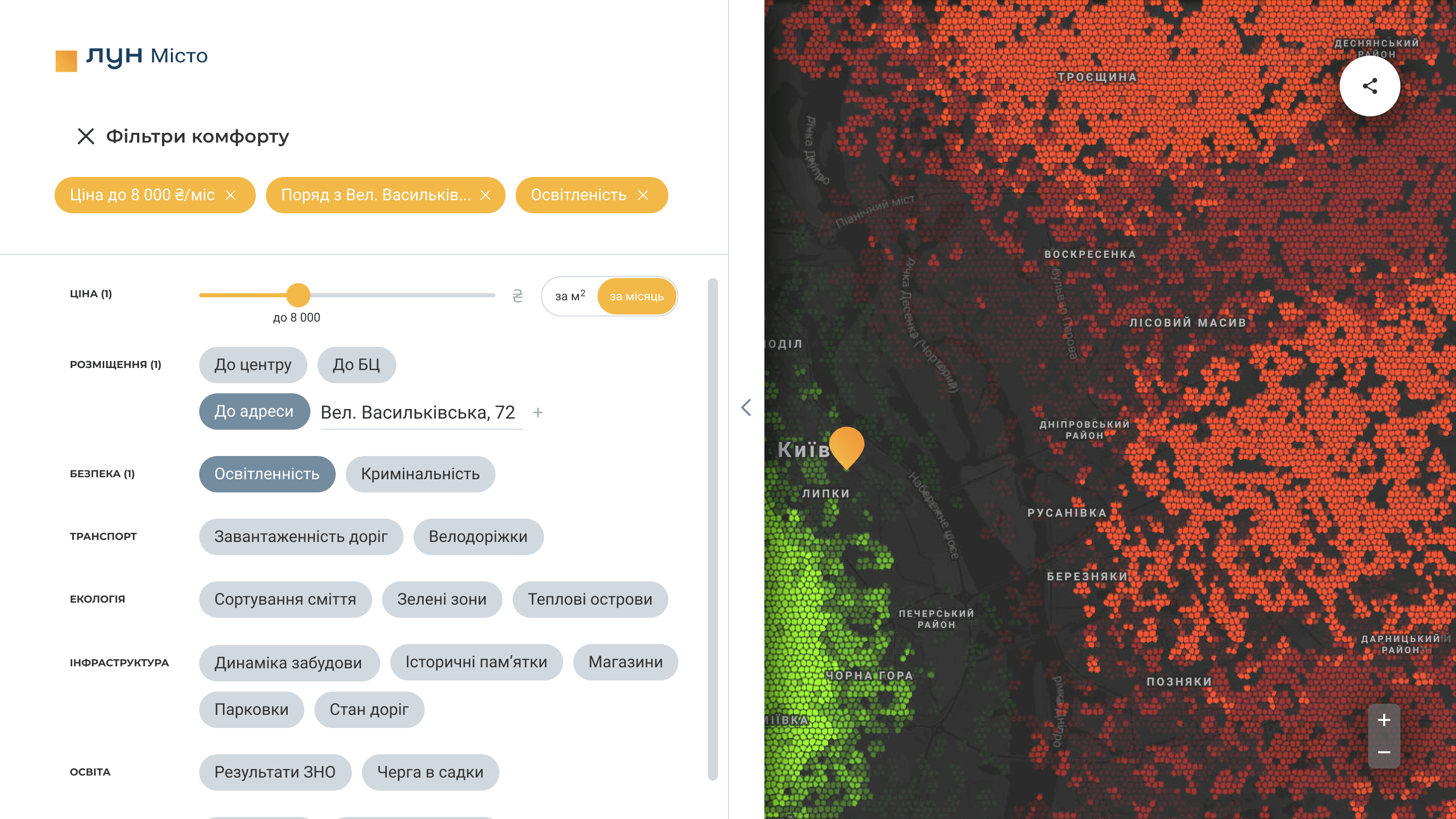
Updated filters
Presentation
As it always happens the night before the presentation, we all got pecked in the ass by a rooster and we finished the necessary materials. I was preparing the presentation, Olesya was finishing the emotional video, voiced with quotes from our interviews, Vlad was engaged in screenshots for the mobile phone, others wrote the texts of the speech.
Our team hit the heart.
We handed over the developed materials to the LUN Misto team and are very much looking forward to the development of our solution.
Another cases
Your move, let's connect
or write an email to:
hi.hlushchenko@gmail.com
