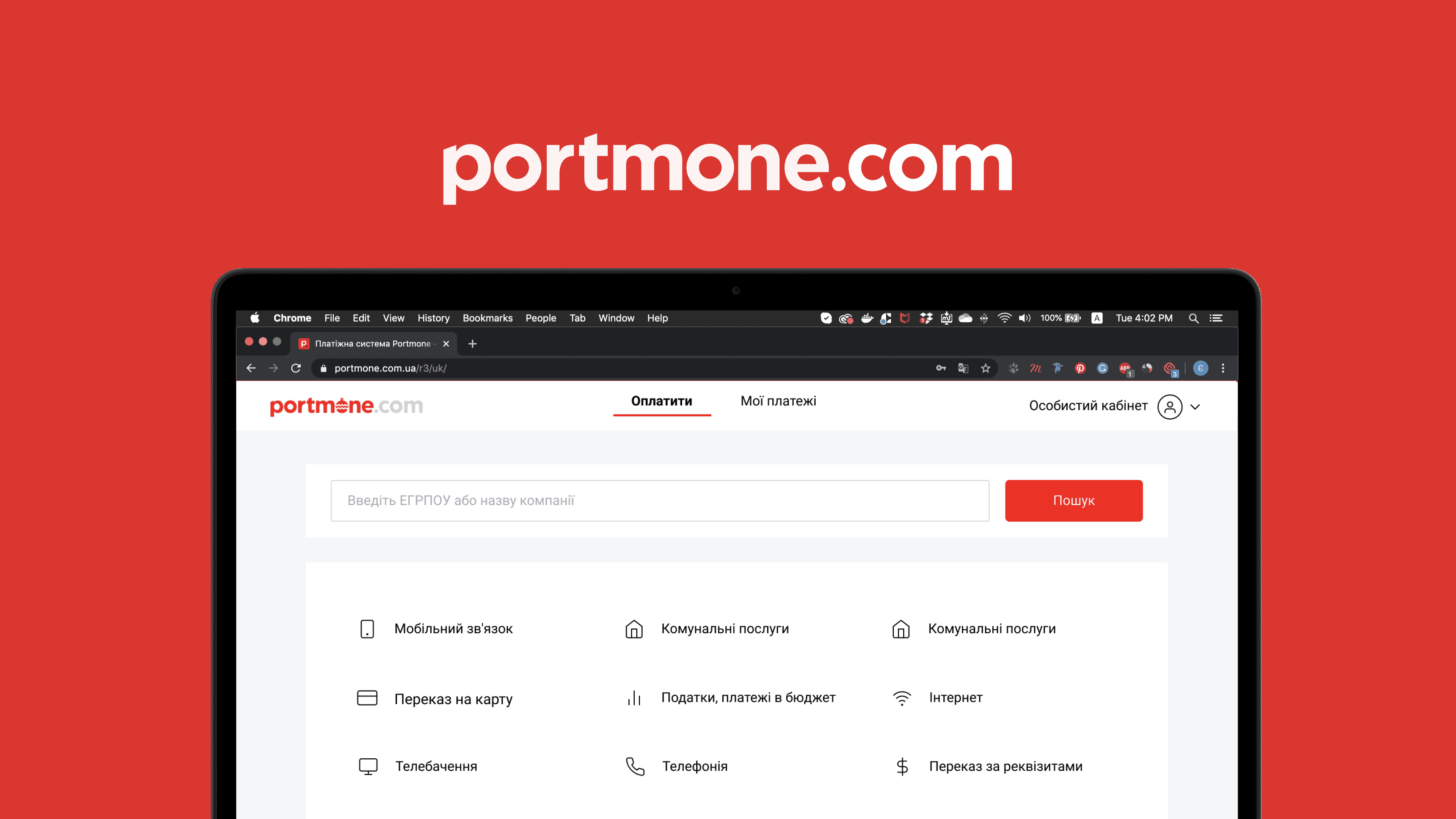
Portmone. Pay in two clicks
We worked with Portmone — it is one of the first Ukrainian payment systems that has been around for 17 years and has thousands of payment services.
And what should be done?
Reorganize navigation;
Rethink the presentation of information in the middle of sections;
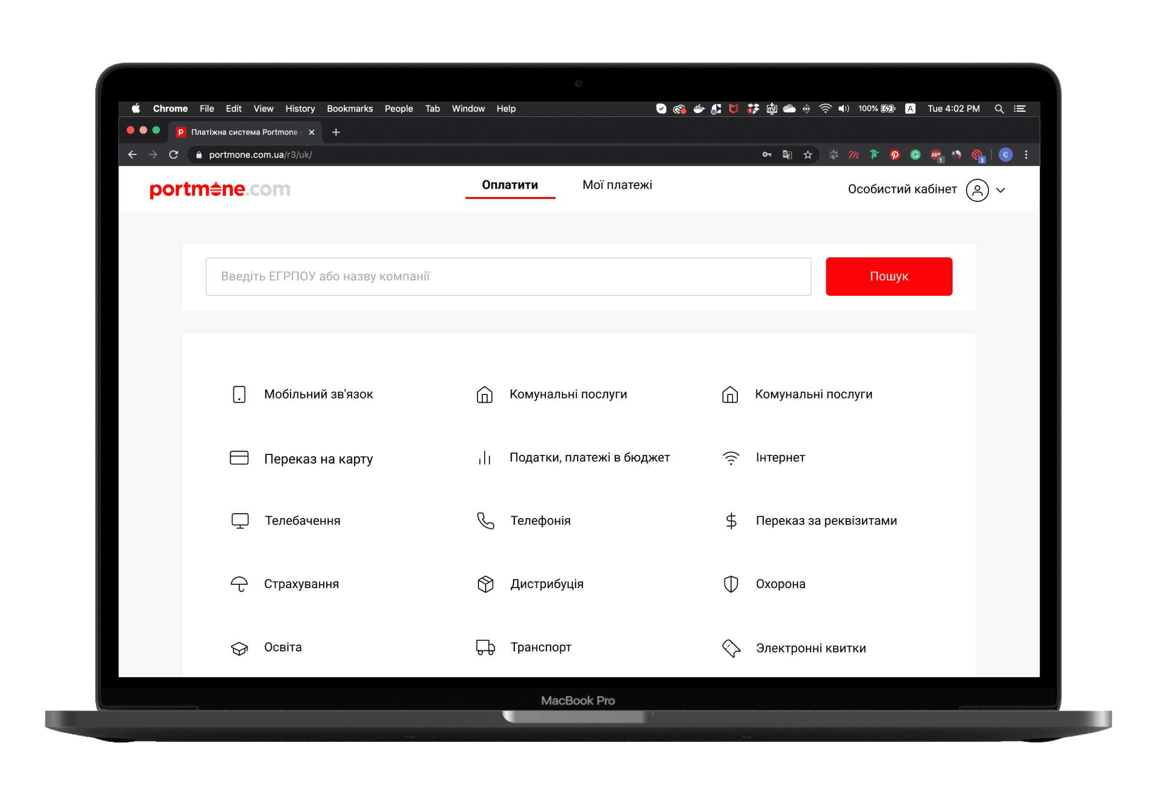
Tell people about 2000+ services that can be paid for.
Go ahead!
Audit
We decided that first we need to check if there is a problem and if so, then delve deeper.
For testing, services that bring the most money to Portmone were selected:
Payment of utility services;
Topping up a mobile account;
Money transfer to the card.
And as a result:
The confusing flow of creating templates and setting up autopayments;
Users are having trouble navigating the personal cabinet due to three different navigation methods;
The information is duplicated in different sections and has different names.
What will we do
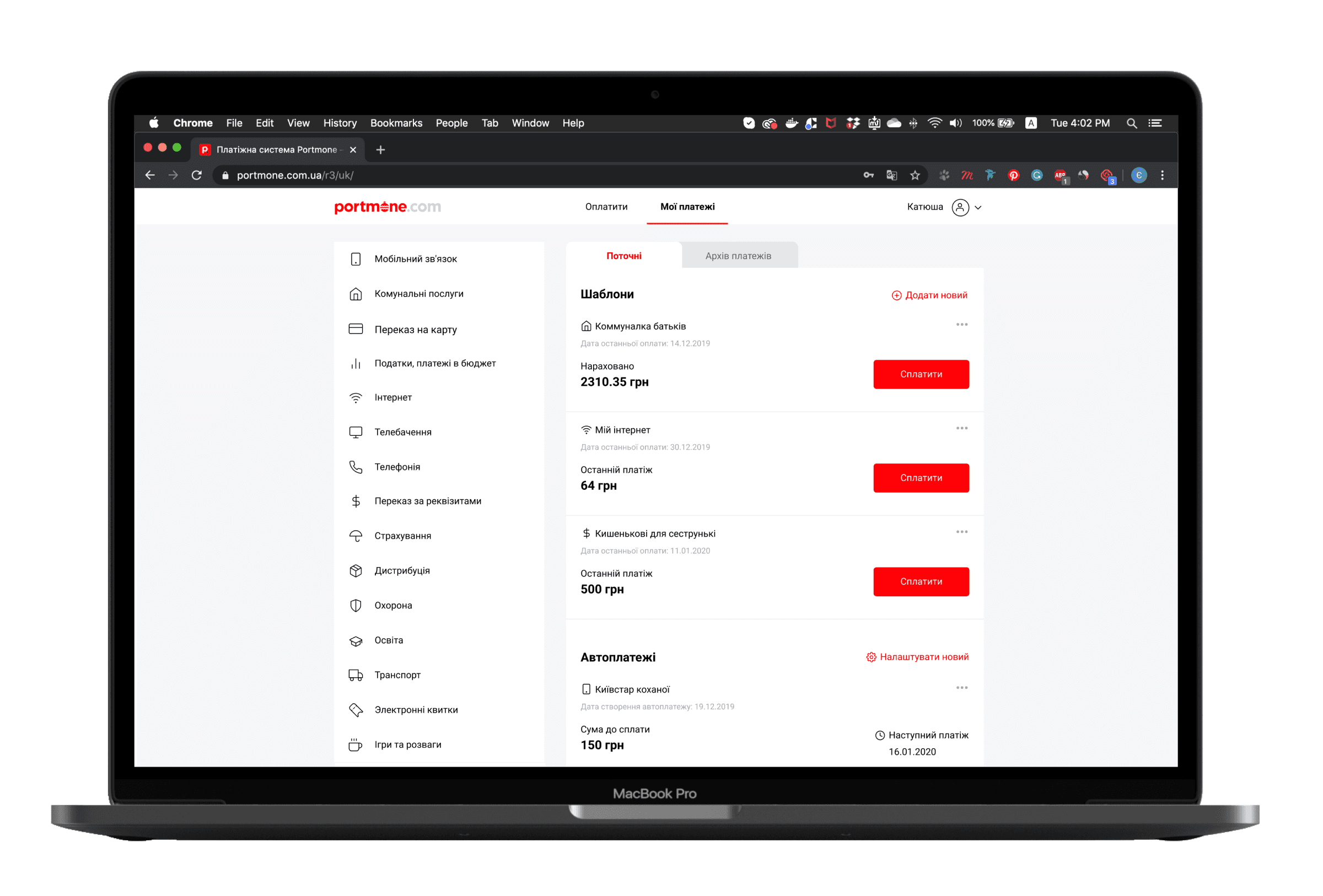
Reorganization of navigation in the personal cabinet. This will help reduce the Bounce Rate of the page;
Simplify the logic of creating templates. It will help solve the user retention problem and grow the base of registered users who make the first payment.
Simplifying the payment for basic services - will help attract new users;
Changing the format of presenting information in sections - will retain existing users and help new ones make their first payment faster.
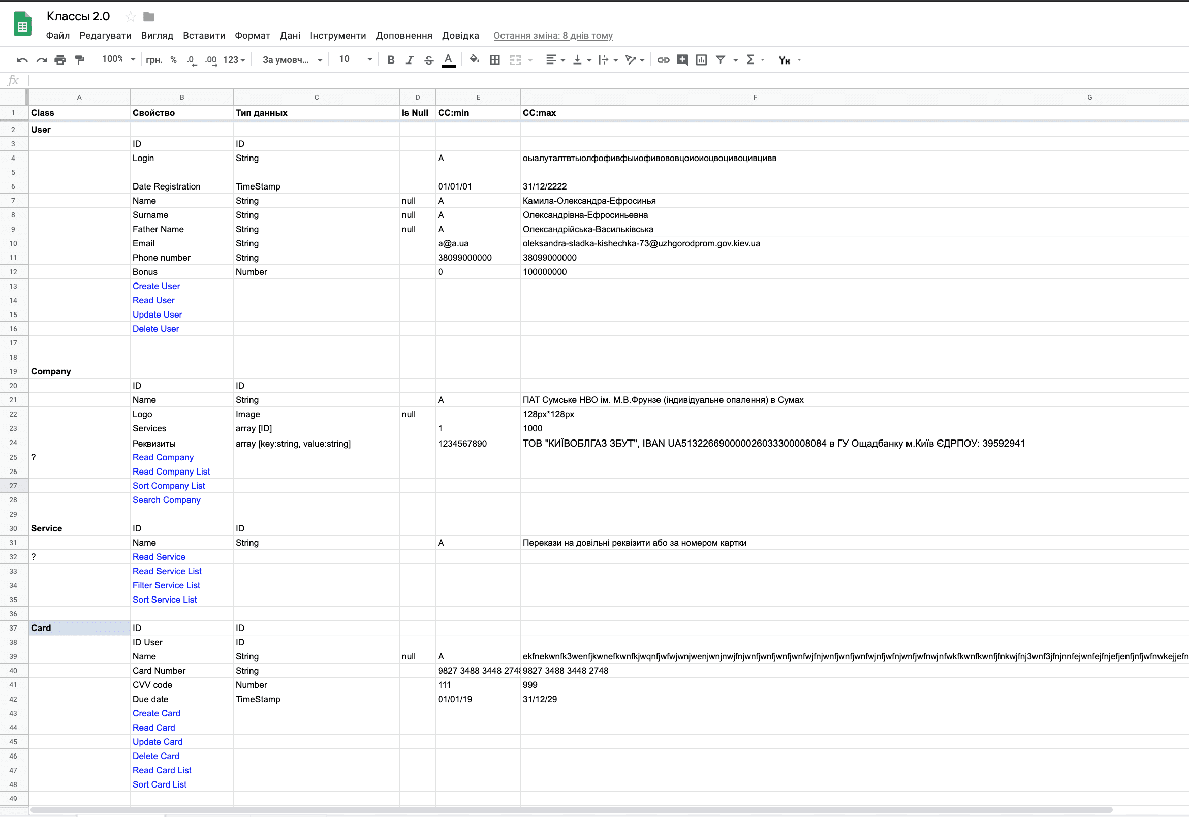
Object-Oriented Prototyping
One of the problems that our business highlighted and we confirmed with an audit was that the same type of information is duplicated in different sections. To eliminate duplicate entities, we broke down the interface into objects and ways to interact with them.
In total, 13 items turned out
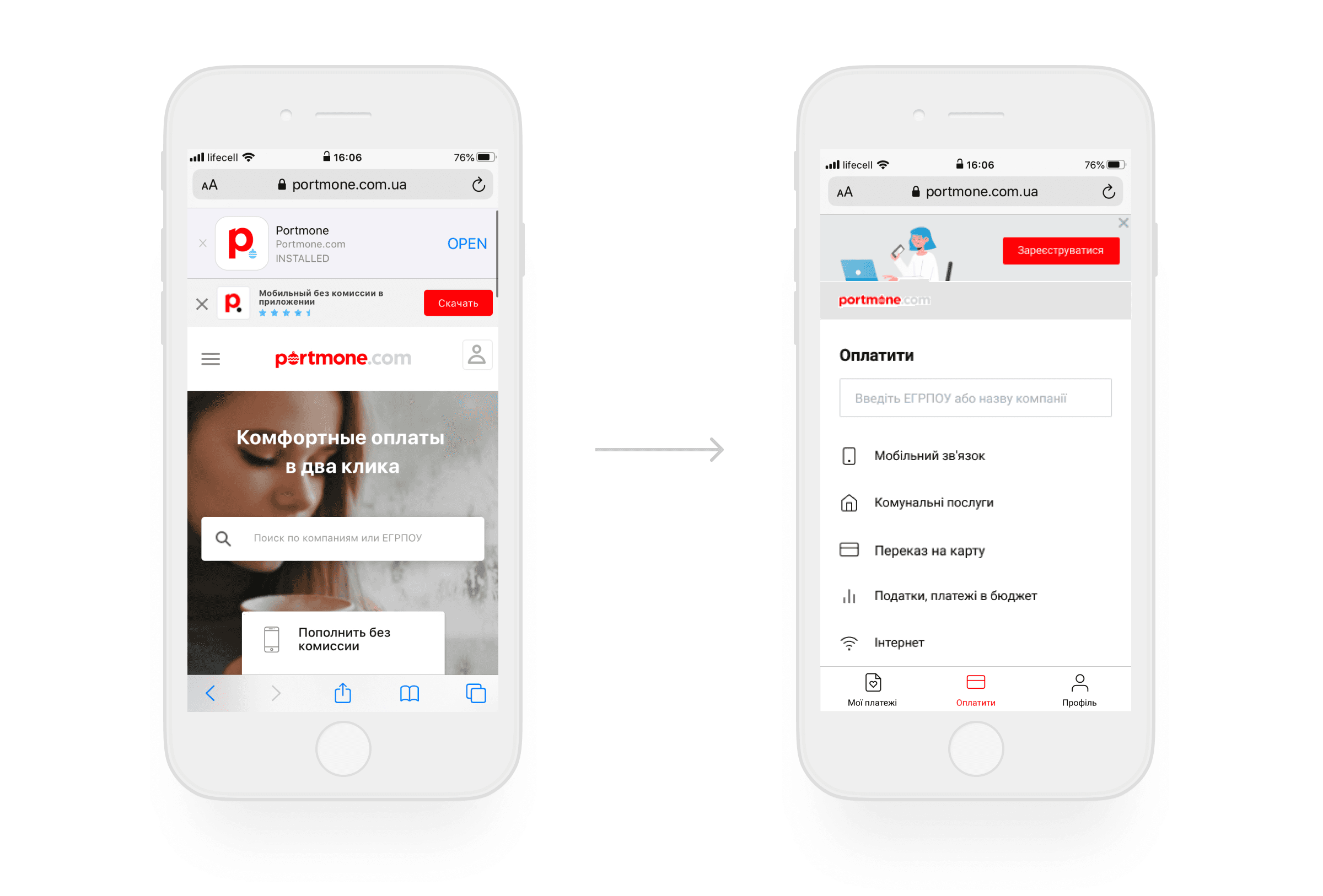
Navigation
Next, these objects need to be made into interface elements, but we first decided to think about the site navigation, as it sets the structure.
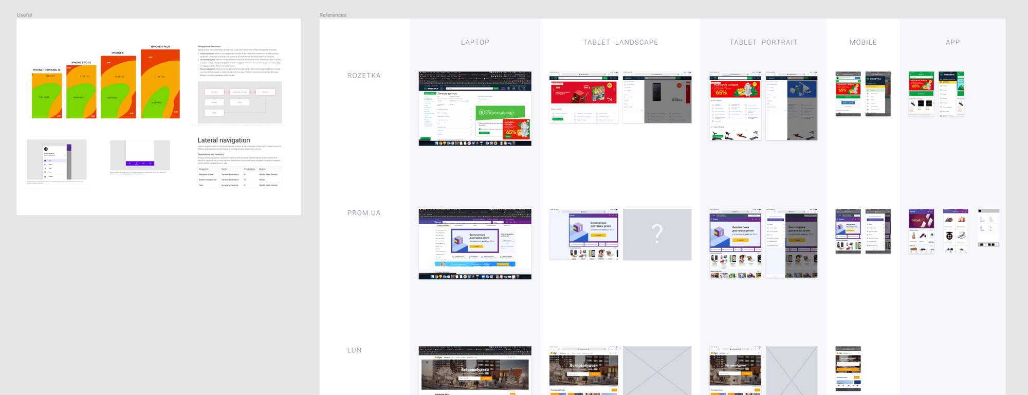
We looked at how other services are made to find some useful behavior patterns that people are already used to.
54% of users use the mobile version of the site, we decided to start with it.
We combined all the information into three groups:
Pay — the start page, a list of services that can be paid via Portmone. Hypothesis: If the start page is called "Pay", then users will perform the main task of the service more often — pay for various services;
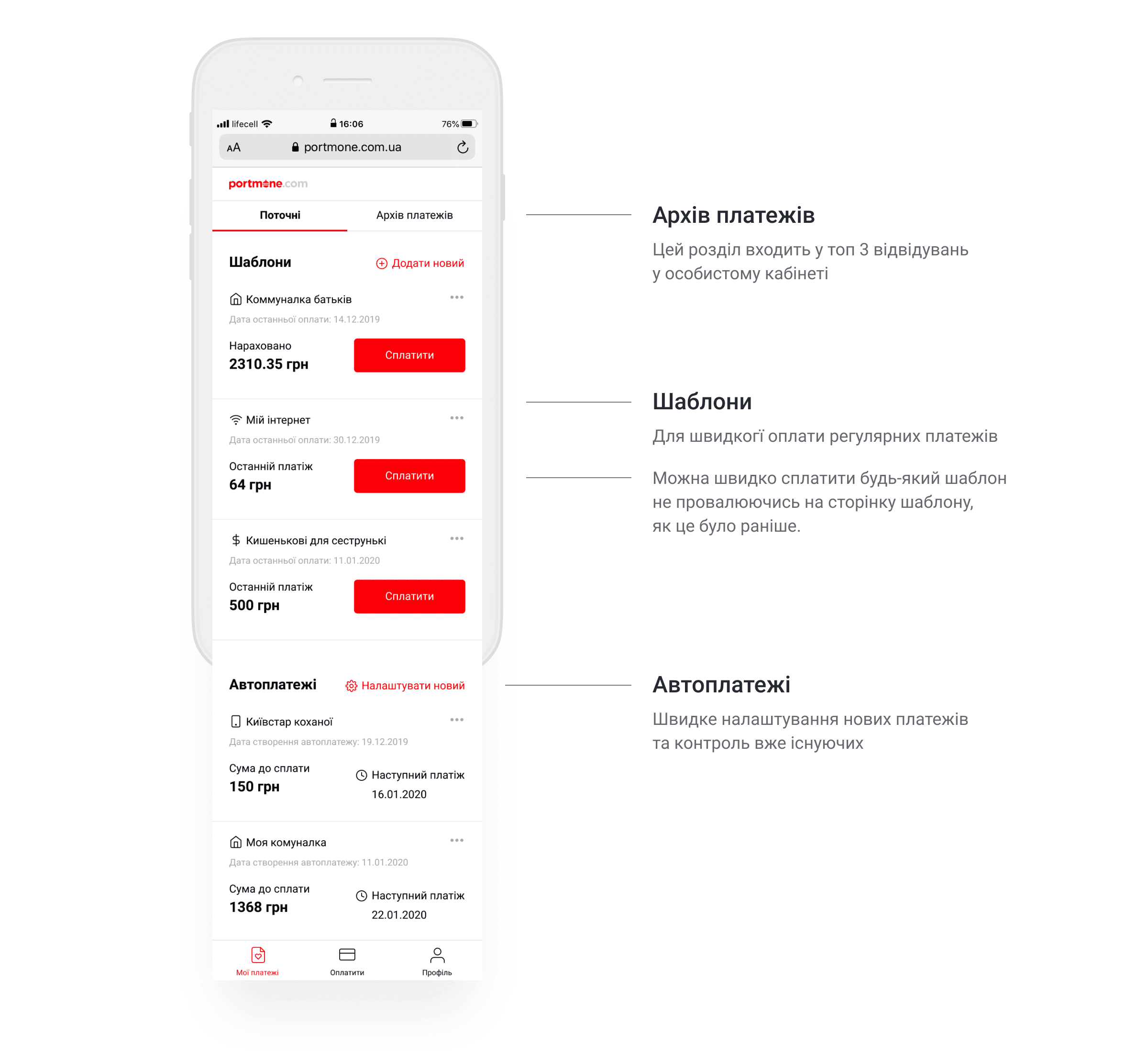
My payments — a personal account where current payments will be located (utilities templates, replenishing your mobile account, auto payments and other created templates);
User profile — where profile and payment settings are located.
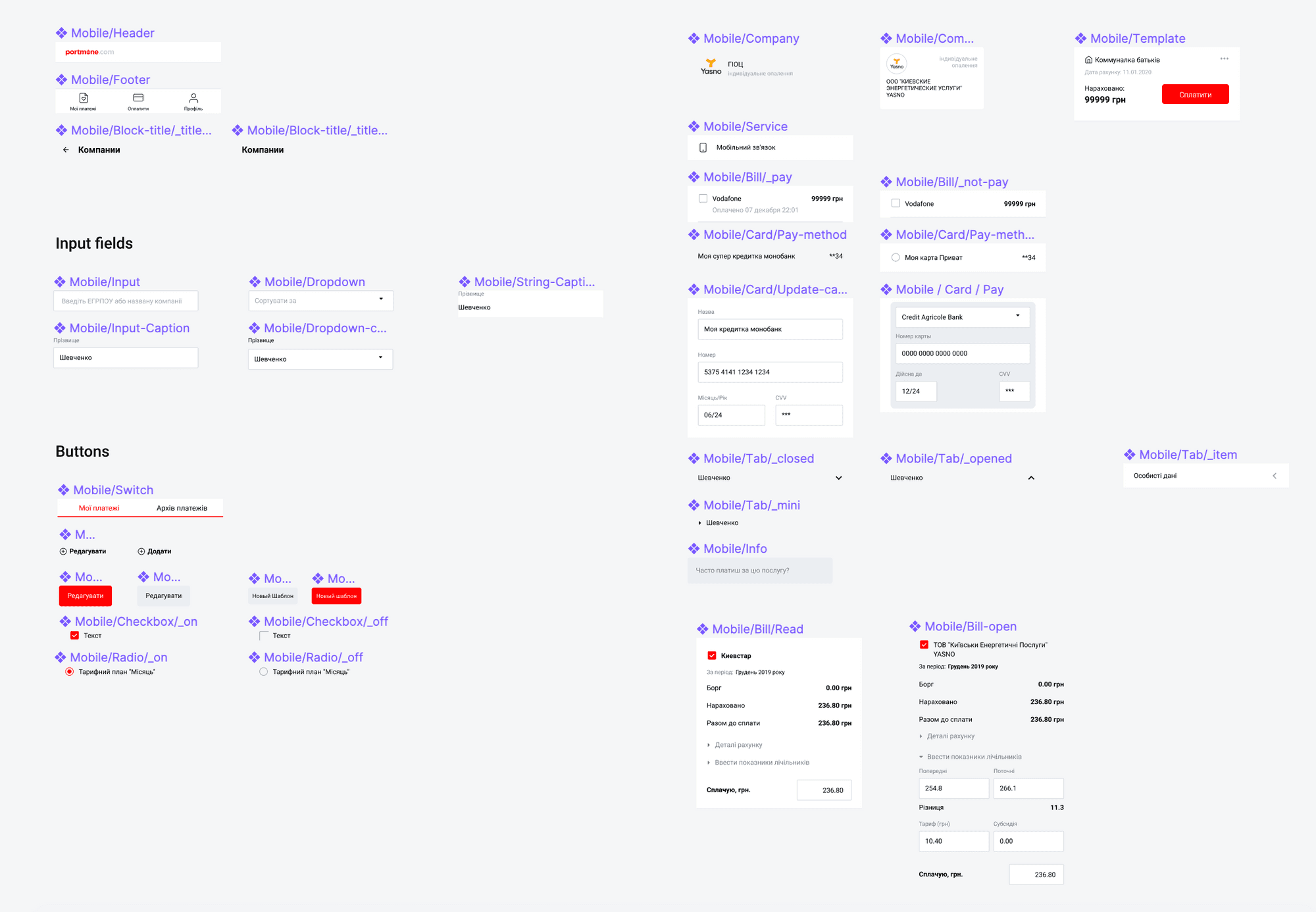
Design System
Now all objects can be moved to the interface, understanding where everything should be. This will help us assemble the interface as quickly as possible and change it according to operational testing results.
To further simplify the developers' work, we used the "BEM" methodology.
Personal Account
💡
A registered user, when landing on the account page, gets lost in the large amount of information and leaves the service.
This hypothesis was confirmed in user tests. So we decided to display only the most important for the user.
Tests
We wanted to get as close as possible to real-life situations when working with the interface, so we made a prototype in Axure.
We conducted more than 40 operational testing sessions, changing the interface of the prototype after each session. As a result, we reduced the time to complete the most popular paths:
Mobile account top-up by 69%
Sending money to a card by 65%
Payment of utility services by 52%
In conclusion
Now I know how to systematically approach the creation and improvement of products;
Practiced in creating design systems;
Got more acquainted with Axure.
Also, we improved the service and now it is really possible to choose and pay for the necessary services in 2 clicks.
Another cases
Your move, let's connect
or write an email to:
hi.hlushchenko@gmail.com
