Scaling a Sports App: From Tennis to Multi-Sport
Palms is a marketplace for sports services. Helping people find and book training sessions, and helping clubs automate their customer experience.
When I joined the project, the guys already had their own CRM system and booking application. They focused only on tennis courts.
💡
During product discussions, we came to the conclusion that we don't need to limit ourselves to just tennis and decided to scale to the whole sport.
We've defined our target audience, identified how people search and book concepts now, improved and accelerated their in-app class booking experience, and defined metrics to track to improve the engagement experience.
1. Target audience
In short, our target audience is people who do sports.
Active athletes who play sports more than 3 times a week;
Residents of big cities who do any kind of sport 3-4 times a month.
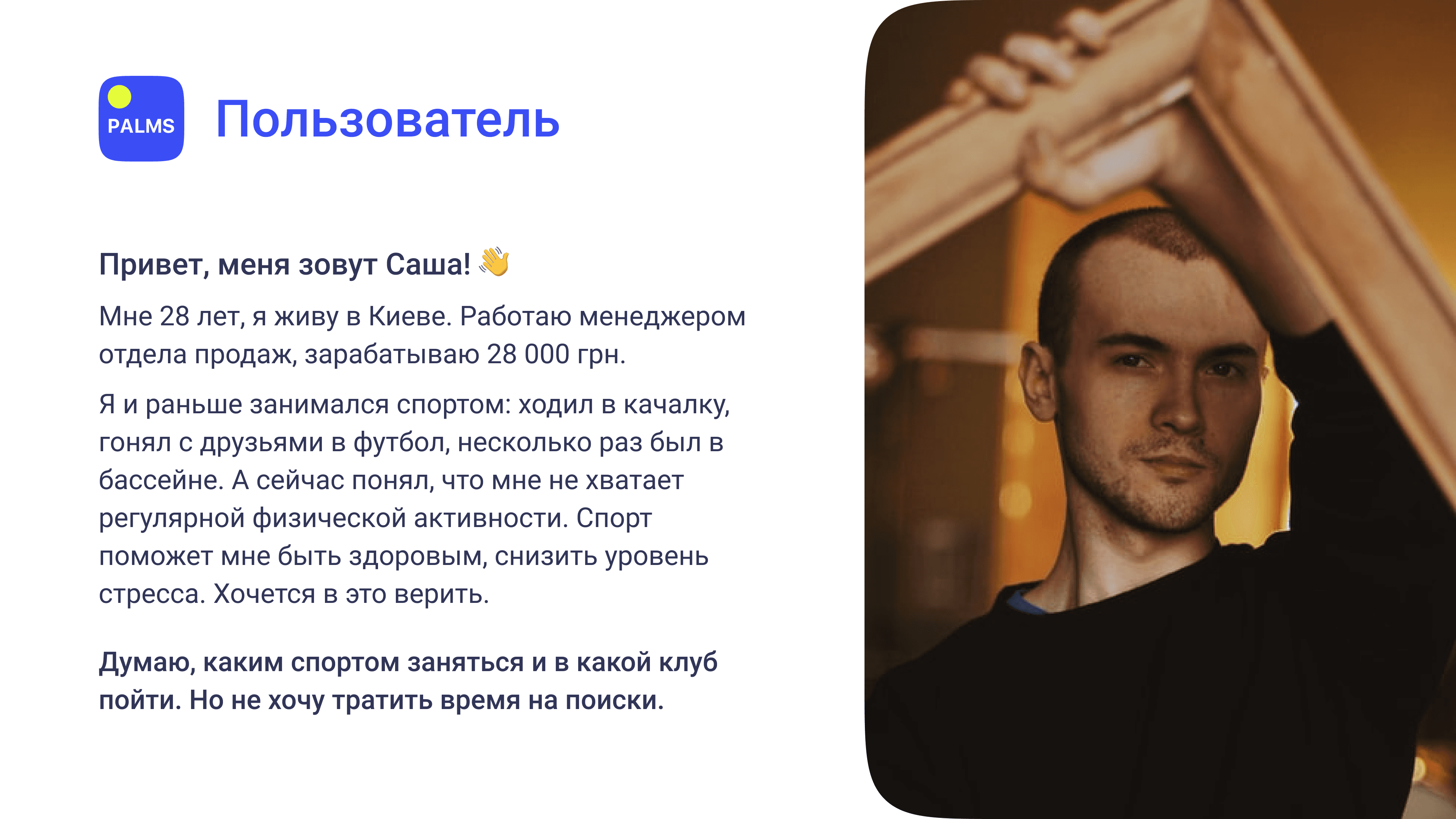
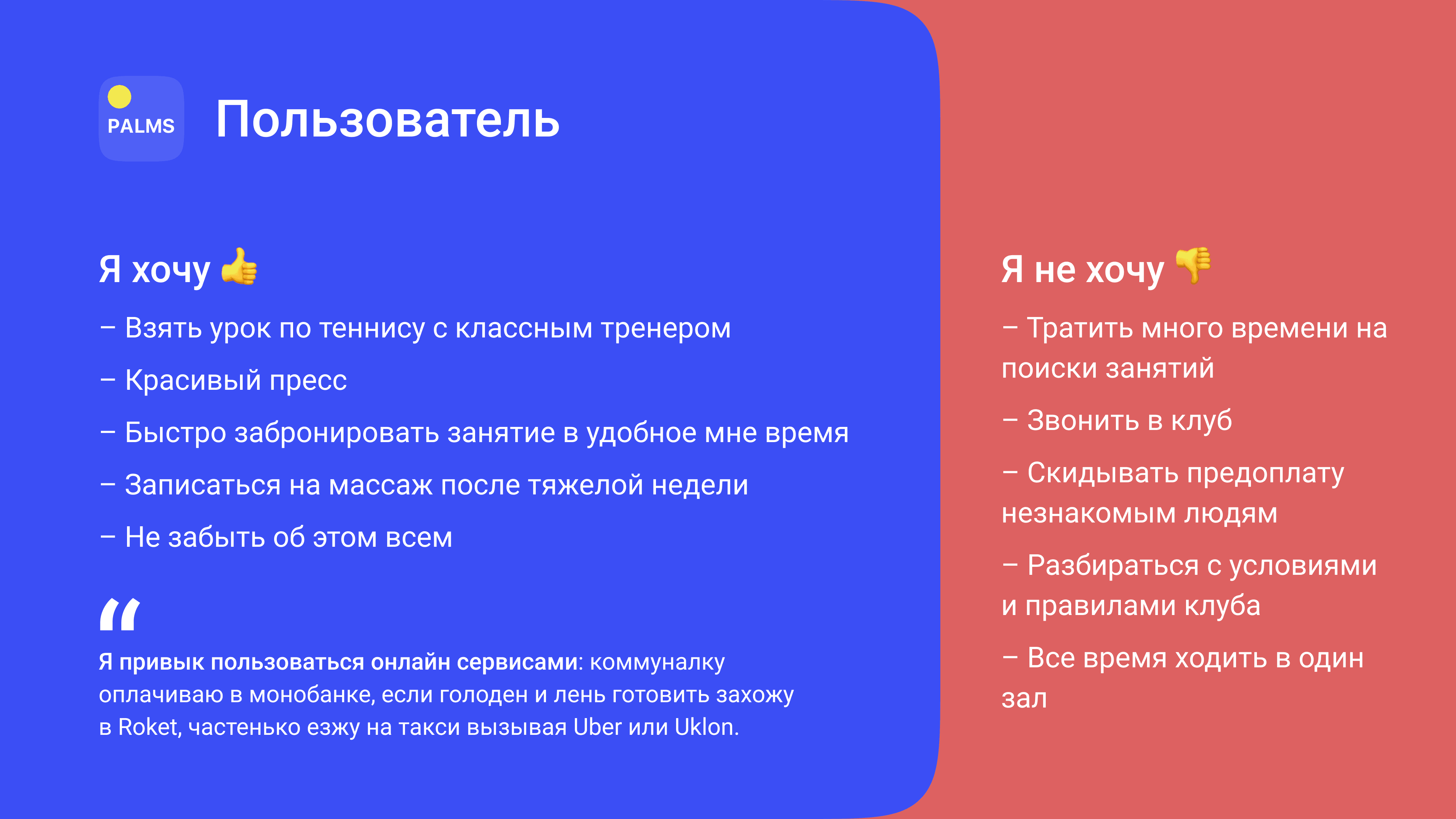
Based on our observations, we created a portrait of the user.
2. How the service will work
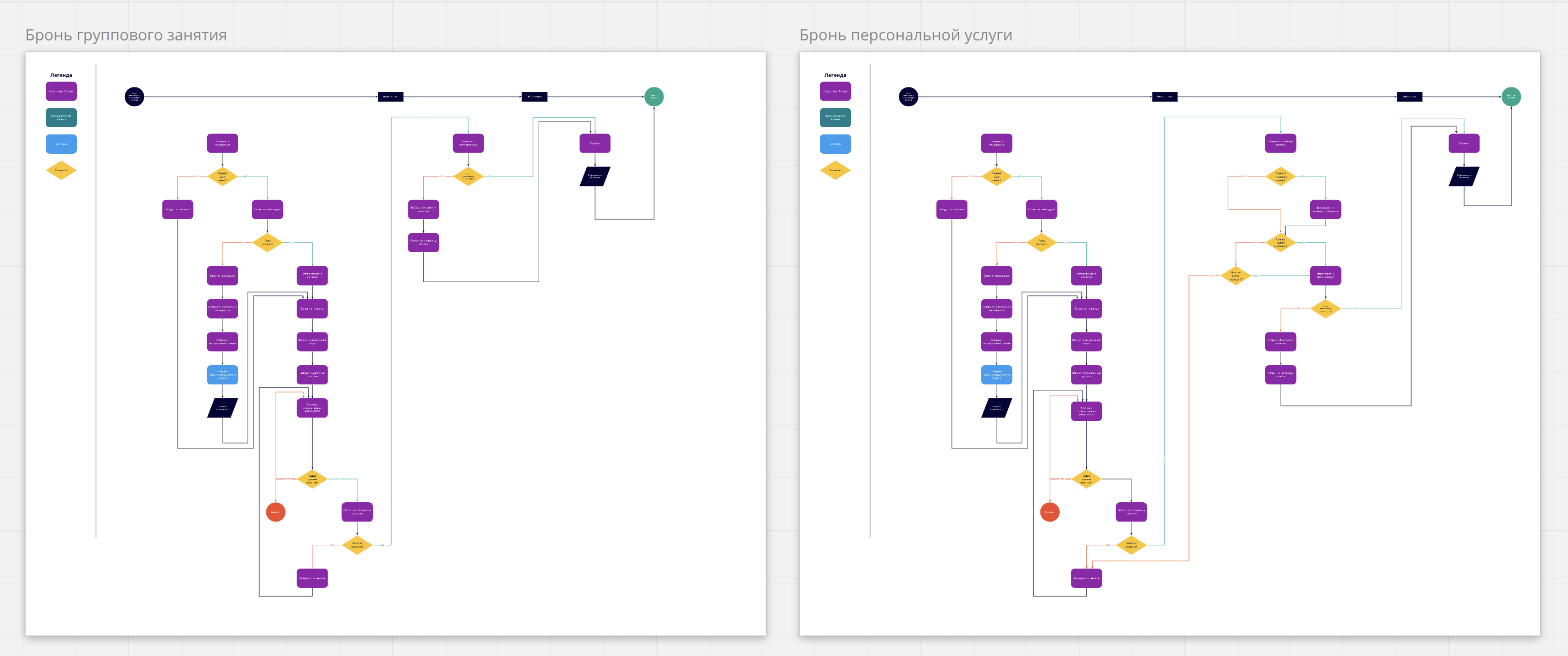
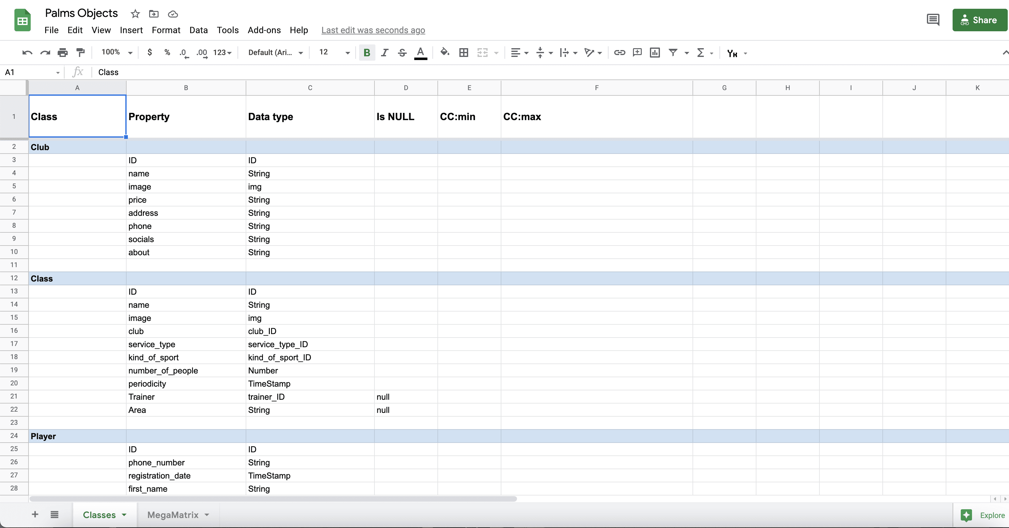
I conducted in-depth interviews, created and improved the user journey diagram and translated it to the application, created a table of objects and roles in the system to prevent duplication of concepts and entities.
After conducting in-depth interviews, I learned from people how they book their classes now and what difficulties they face in the search.
💡
Nowadays, it is difficult for people to quickly find an activity that would interest them.
To find a class, a person needs to find a suitable club, call it or write to it on Facebook/Instagram, wait for an answer, look at the schedule (at best on the website, at worst - on a photo of a sheet with the club schedule hanging in the club), communicate again with the club, recognizing if there are free seats. In general, the process in the context of reality is not very good.
I built a class booking process and gradually began to improve it, to throw out everything that was unnecessary.
Final booking processes
Then I decided to disassemble everything into objects, so as not to produce essences in the future and to update the CRM system for clubs. This should help developers speed up their work.
3. Interface
Designed the navigation, the screens, developed the prototype and tested different user paths.
Basic functionality
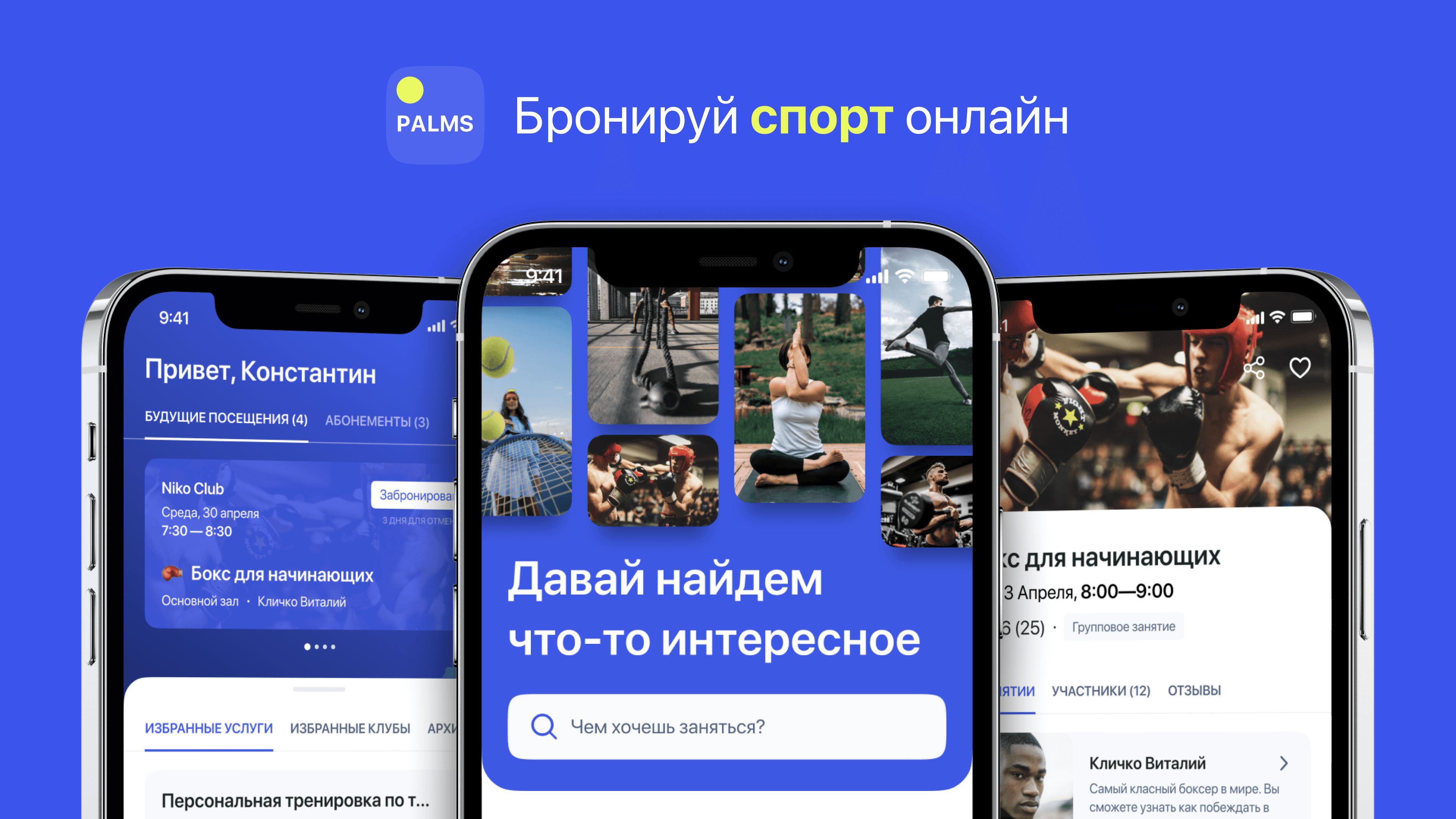
First of all, we wanted the user to be able to quickly find classes. That's why we've simplified app navigation as much as possible, highlighting the most important.
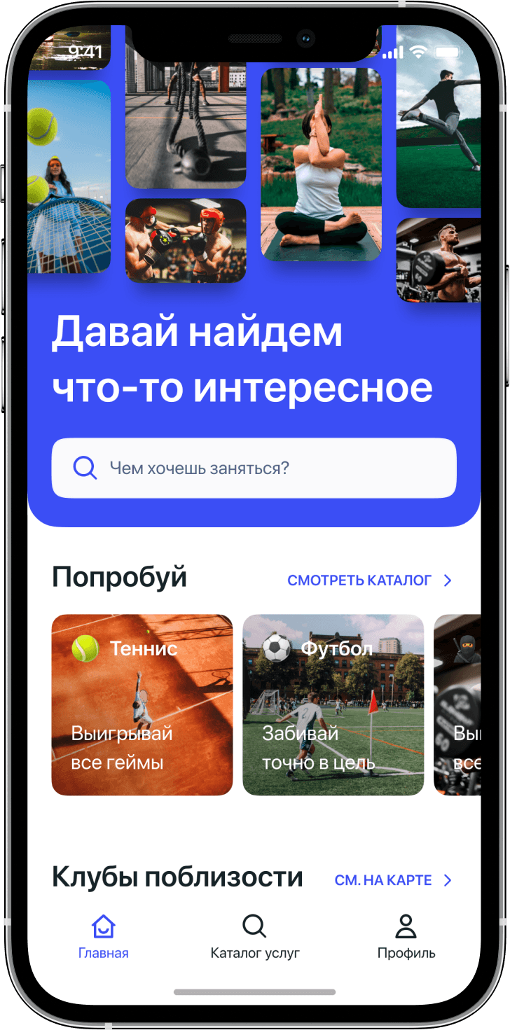
1. Main page
Decided that the main page will immediately encourage the user to do sports. To do this, I put a search on top so that people can immediately start looking for what they are interested in.
If a person comes and doesn't know what he wants to do, we offer him popular sports, motivating him to try something new or interesting.
We plan to add a section with the nearest events (tournaments, marathons, etc.) to show what else you can do.
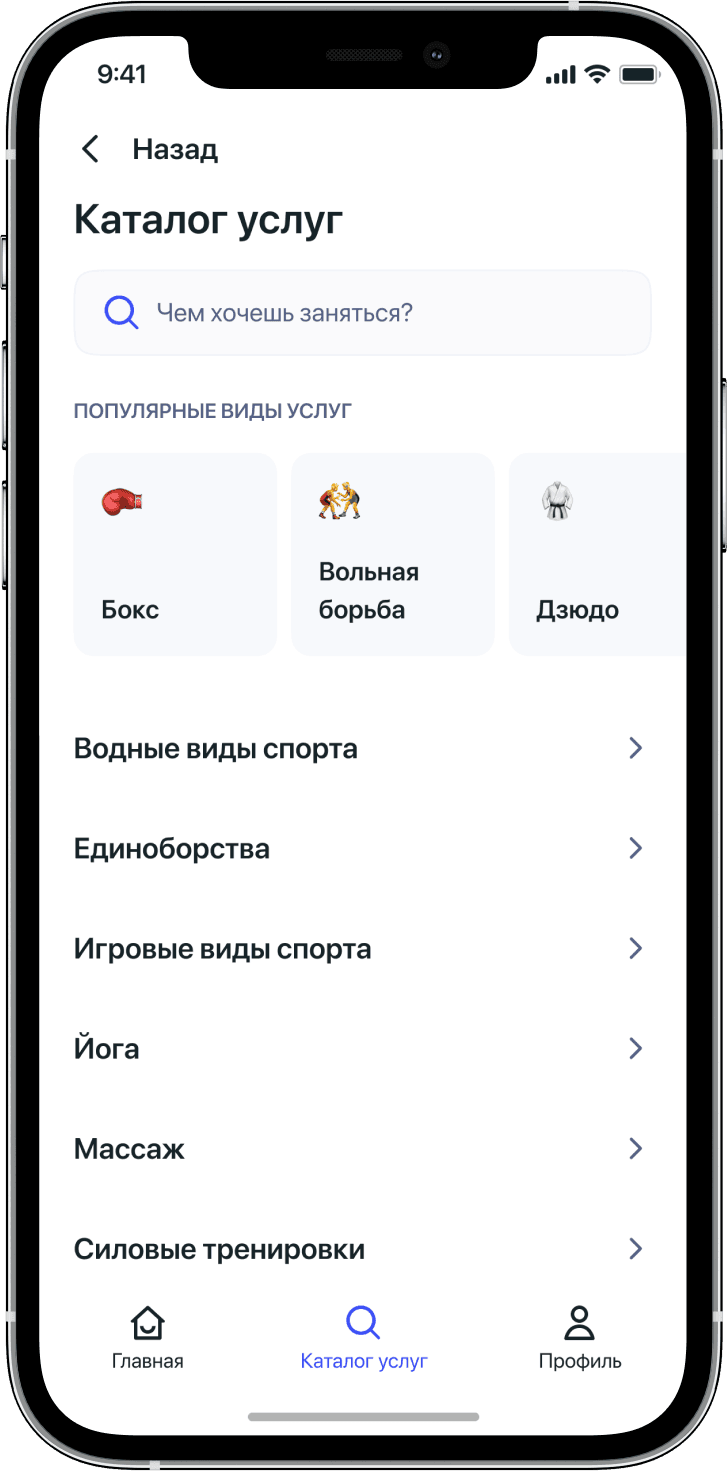
2. Catalogue
Everything is simple here — we give a person the opportunity to see the variety of sports and find what interests him the most.
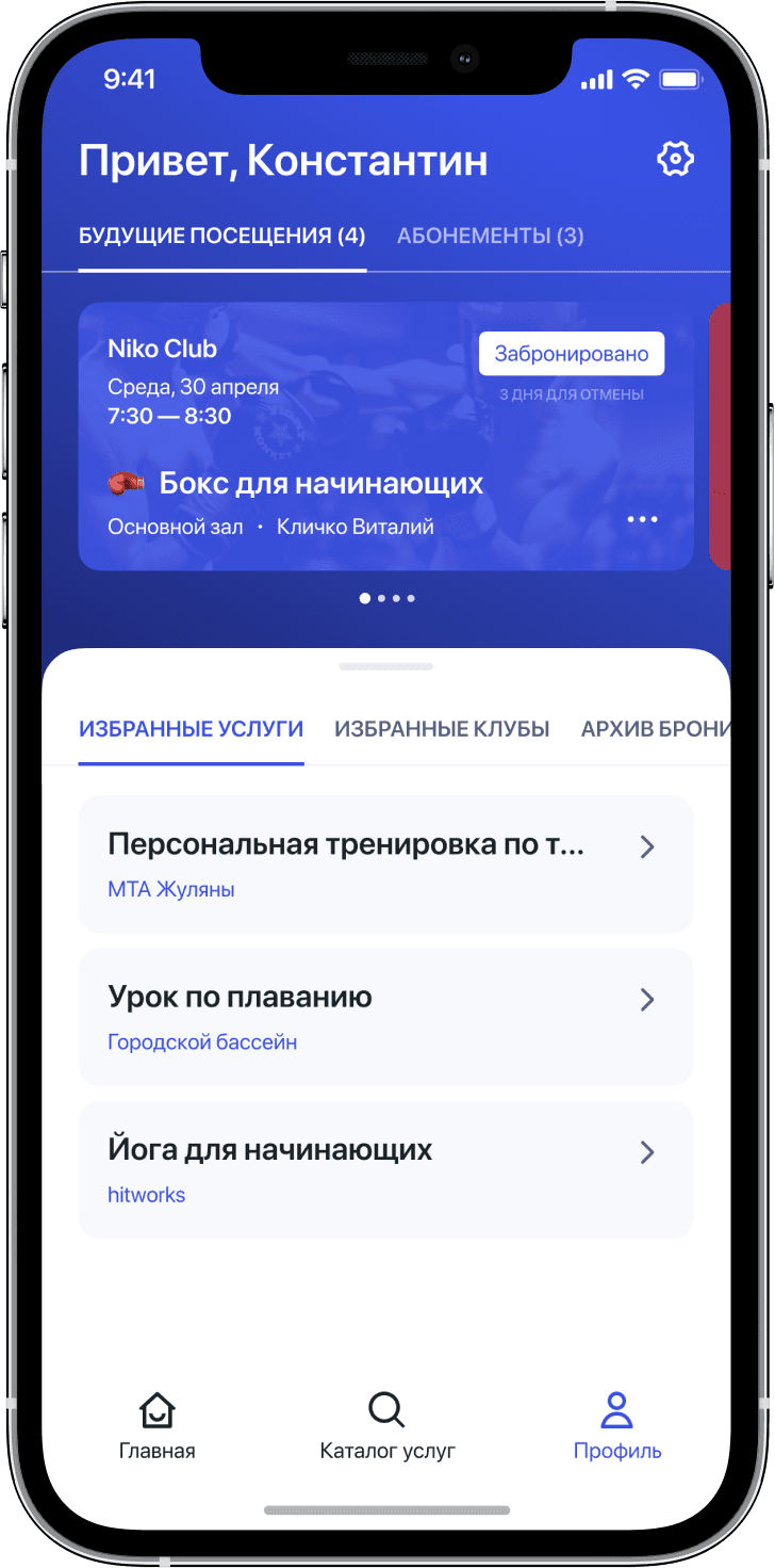
3. Profile
This is a screen where you can see future classes, purchased season tickets, last attended classes (with the possibility of quick booking) and selected clubs.
Search
💡
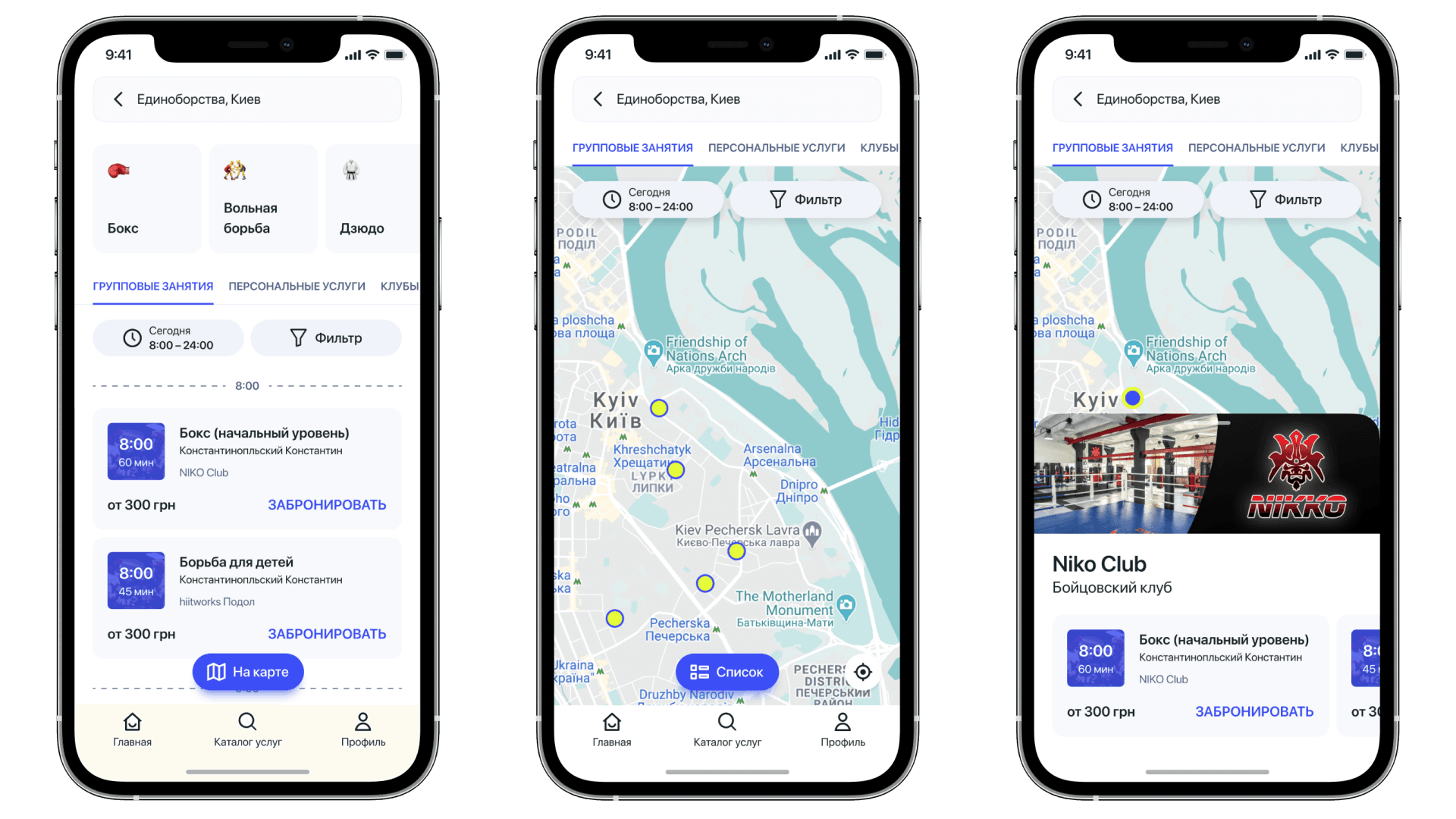
We realized that people are looking for classes, not clubs (as already implemented in the app), and we give them that option.
Usually, classes are sought from a type of sport, sometimes from a specific one, sometimes more generalized. Some people go for personal training, or simply book the services of clubs (for example, rent venues (tennis courts, football halls, etc.)). Someone goes to group training, and since their logic is a little different, we decided to separate these activities.
Classes pages
Each object in the application has its own page, where you can find out all the information. For example, on the page of the service, you can read about the service itself, about the trainers you can choose, about the sites where classes can be held and see reviews.
And as I said before, the logic of services differs precisely in the sequence of reservations.
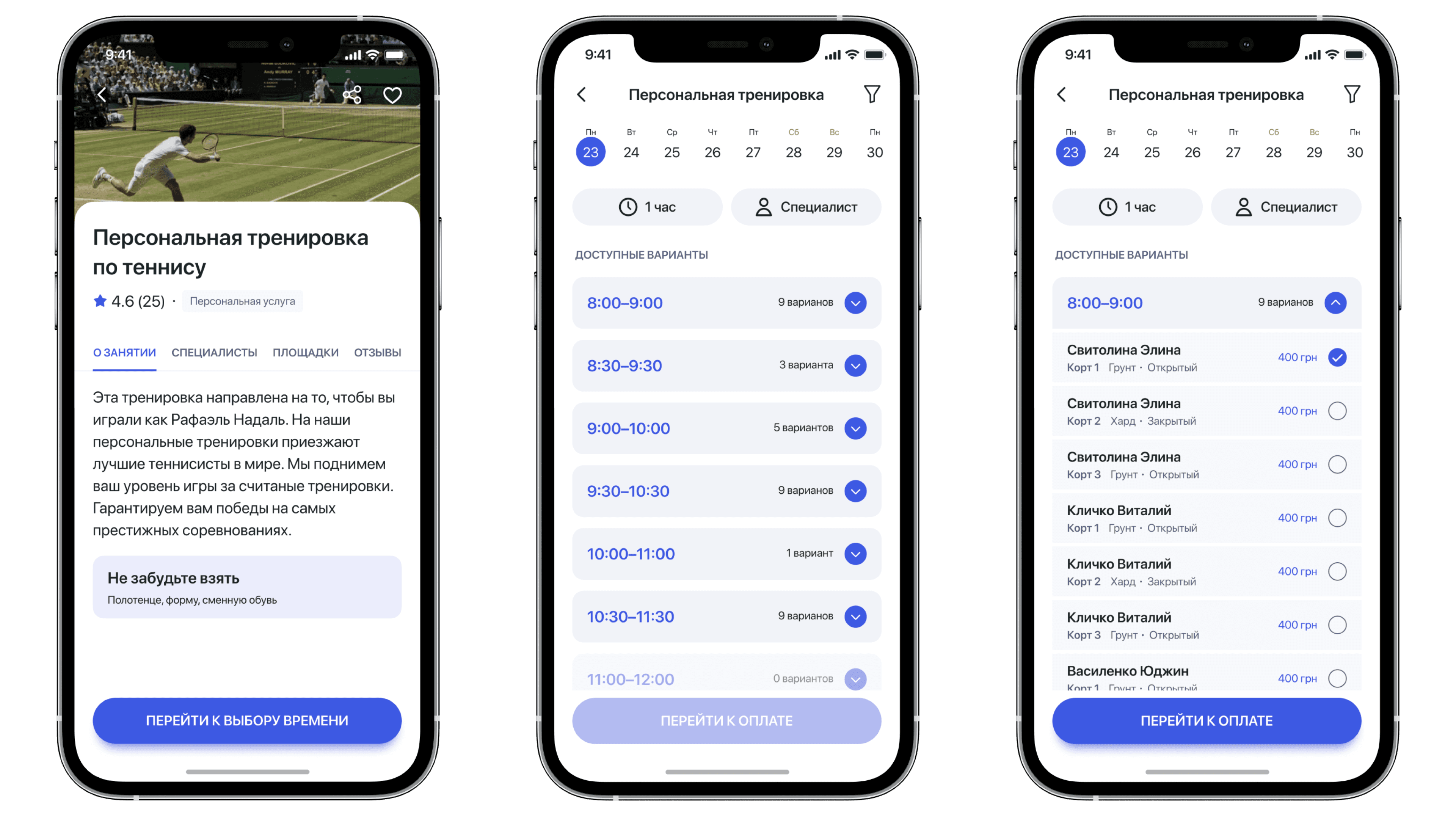
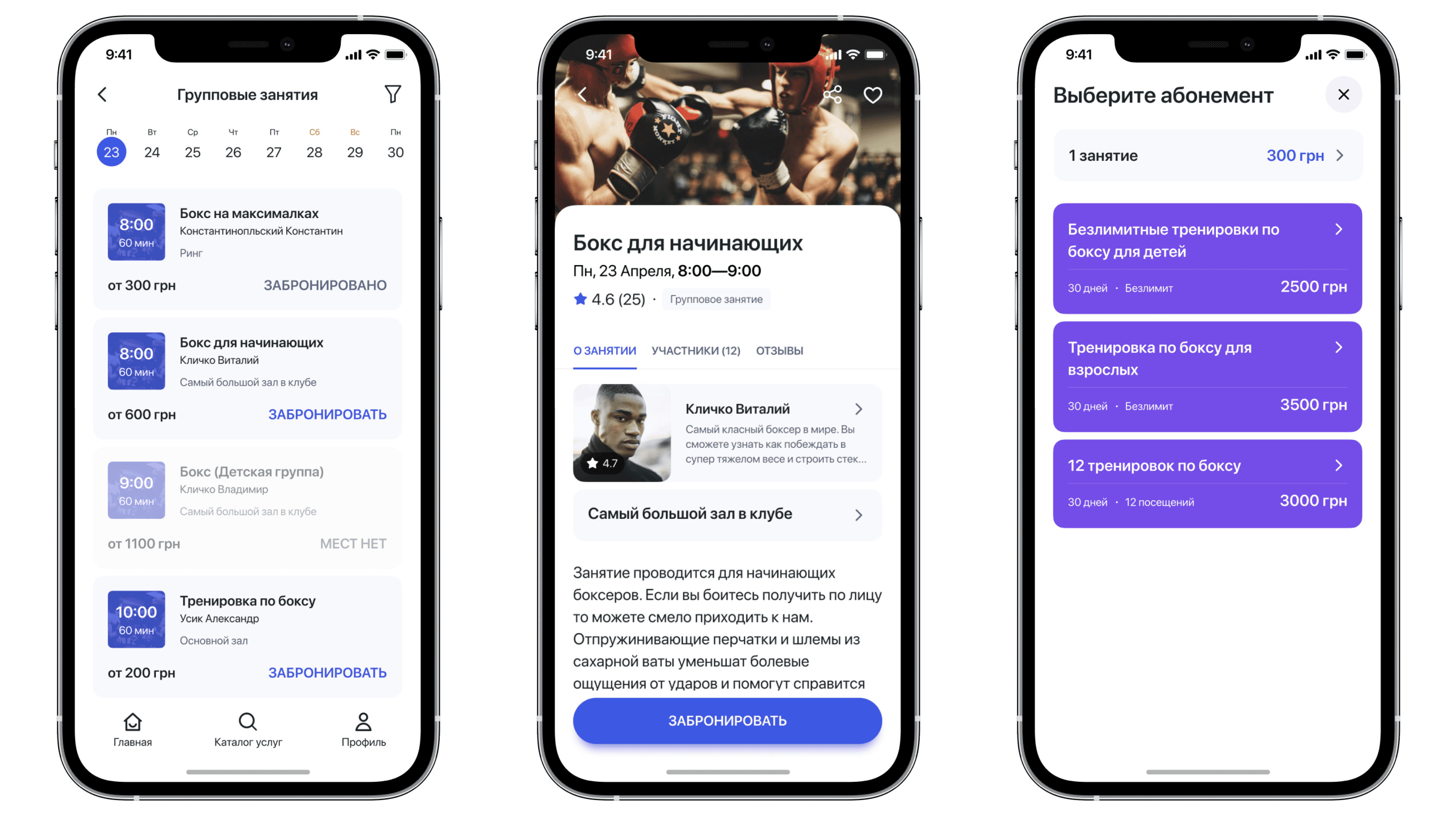
People usually collect personal classes — they choose which coach to train with or which court to play on, plus you need to find free time for this. Group classes are usually fixed, they are always led by one trainer, they take place in a specific room and at a specific time.
Personal class
Group class
I checked the interface on moderated and unmoderated tests. Conducted several iterations of improvements before releasing to development.
💡
All booking methods have been successfully tested. People find the information they need and understand how to book.
4. What's next?
We have identified important metrics to test the success of our solution and improve it further.
We will monitor the following indicators:
Life Time Value (LTV);
Rate of return to the application;
Number of active users per day, month.
And of course we will work with feedback, in social networks and application stores.
Another cases
Your move, let's connect
or write an email to:
hi.hlushchenko@gmail.com
